Redesigning Nava 360 Client Experience
A developer-aware, low-effort, high-impact UX redesign for a booking and management mobile application.

Objective
To redesign the mobile client experience for Nava 360 by improving usability, reducing cognitive load, and streamlining critical booking flows, while retaining the existing backend architecture and core user journeys.
The goal was to deliver a low-effort, high-impact UX upgrade that could be implemented incrementally in a live production environment, balancing user needs, business constraints, and developer feasibility.
This work was conducted under a Non-Disclosure Agreement (NDA) and is shared solely for recruitment and evaluation purposes; the designs and content may not be copied, reused, or distributed.
My Role
UX Research
Product Design
Testing
Tools
Figma
Illustrator
FigJam
Qualtrics survey
ChatGPT
Google sheets
Google docs
Cross-Collaboration
Product
Engineering
Quality Assessment
Sales and marketing
Background & Challenge
Nava 360 serves clinics, spas, and auto workshops with end-to-end business management, enabling users to book clinical appointments, group classes, and service bookings through its mobile application. Over time, the app evolved from a web product directly adapted to mobile, with features layered on to meet changing business requirements. This resulted in a fragmented mobile experience, usability issues in core flows, and growing user frustration.
The challenge was to redesign the UX without redefining the existing tech stack, which was tightly coupled to multiple datasets and live services. Core user flows such as login and booking had to be retained, meaning visual refinement alone would not solve the underlying problems. The redesign demanded a solution that balanced meaningful UX improvements with technical feasibility, requiring close consideration of both product design and development constraints.
My role was to identify key user pain points across the existing experience and design a solution that better satisfied user needs while remaining easy to implement for developers. I focused on creating a low-effort, high-impact redesign that improved clarity, reduced friction, and respected backend dependencies, ensuring the product could evolve without disrupting users or the engineering workflow.
"The app is complicated for what should be a quick booking."
"I had to create a new account since I forgot my password, but my mobile number couldn't be verified".
“I’m not confident that I’ve done things the right way, it doesn’t feel intuitive.”
“I don't know how to reach out to the business for more info.”
“I wanted to go back a step and check something, but I could not continue but start again."
Booking
3 out of 5 users were unable to complete a booking successfully on their first attempt without assistance.
Rescheduling
2 out of 5 users were unable to find the option to reschedule an appointment without guidance.
UX Scores
A CSAT score below 3/5 combined with a SUS score of 54/100 highlighted significant usability issues
"How might we redesign the mobile experience so users can complete bookings and manage appointments easily and confidently, keeping implementation simple for developers?"
A fully redesigned Nava 360 Client Mobile App for booking and managing appointments, services, and classes, rebuilt with a user-friendly, highly intuitive, and responsive experience. The new design delivers mobile-first usability while reciprocating the depth of a comprehensive web platform, including features such as in-app messaging, push notifications, and streamlined management tools that support end-to-end user journeys.
Final Solution
_gif.gif)


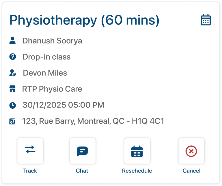
Efficient Booking
Since booking is the core of the product, the experience was redesigned using a one-step-at-a-time approach, where each screen focuses on a single primary action and clear breadcrumbs guide users through the process to eliminate user drop-offs.
Once a booking is completed, in-app notifications and booking management cards were introduced to help users track, manage, and stay connected to their appointments and services with confidence.

Eliminating Duplicate Profiles
User profiles were frequently duplicated when users forgot their passwords, resulting in multiple accounts for the same person. To address this, we redesigned the user journey to verify existing records in the database using the phone number as a unique identifier (UID) before allowing account creation.
If a match was found, the system merged historical data and bookings into the active account, preventing duplication and ensuring continuity in the user’s history while reducing backend and support overhead.

Communication is the key
App users frequently faced friction when trying to communicate directly with businesses, especially when rescheduling or cancellation options were disabled. In these cases, users were forced to make phone calls, which many found inconvenient and undesirable.
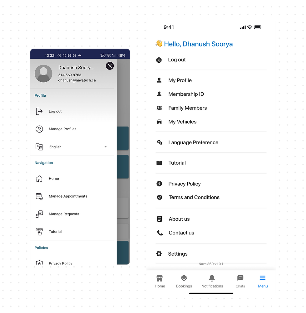
To address this, an in-app chat feature was introduced, allowing clients to communicate directly with the business administrator. This enabled faster resolution of rescheduling and cancellation requests, reduced reliance on phone calls, and improved overall user confidence and satisfaction.
Before & After
Every screen and interface element was fully redesigned and redefined, creating a consistent, cohesive visual language and interaction system that improved clarity, usability, and flow across the entire app experience.


The Process
Key Research Insights
Based on qualitative usability interviews with 5 participants, who completed predefined tasks within the app followed by a semi-structured interview to capture insights, pain points, and behavioural feedback
05
Total number of Participants
3/5
Participants could not complete all tasks successfully
33%
Average customer satisfaction score
57%
Average system usability score
Defining the Problem
Key insights revealed usability issues in the existing user flows and information architecture, leading us to map all screens, reverse card-sort the structure, and redesign it for clarity. Based on research findings, features like in-app chat and notifications were added to better support user needs.

Design and Develop
Once the information architecture was finalized, we defined a design system to ensure consistency across colors, typography, components, and interactions. This also supported developers by enabling reusable style guides and CSS properties, reducing implementation effort and improving maintainability.

Simultaneously, we created low-fidelity mockups and wireframed for key process flows, breaking each function into multiple screens using a one-action-per-screen approach to simplify interactions and reduce cognitive load.


Mapping each user step helped us clearly define the end-to-end user journey from the user’s perspective, while also enabling more efficient alignment and optimization of the underlying backend architecture.
Next Steps
Once the low-fidelity mockups were translated into high-fidelity prototypes, the designs were delivered to developers through a detailed presentation, with ongoing support to explain flows and logic as needed. The product is currently under development, and the next phase involves usability testing and benchmarking the new app against the previous version and competitor apps to achieve maximum usability and a effortless user experience.
Key Takeaways
This project taught me how to design impactful user experiences within real-world technical constraints, balancing user needs with developer feasibility. By thinking system-first and shipping incrementally, I learned how meaningful UX improvements can be delivered without disrupting existing products or backend architectures. Working closely with Sundar, CEO of Nava Tech, was instrumental, his mentorship challenged my design decisions, grounded ideas in technical reality, and emphasized quality at every stage.